Why My Favorite Design Trend Flopped: A Hard Lesson Learned
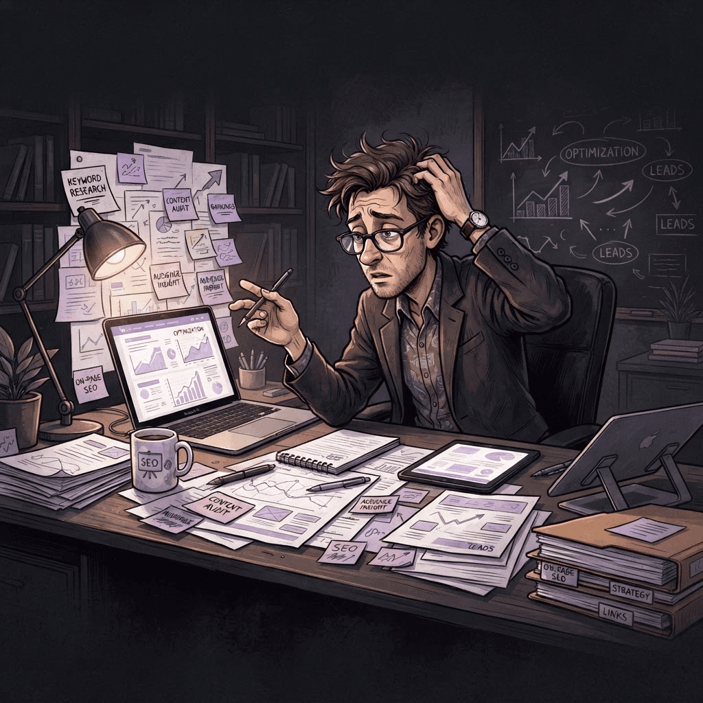
Discover the insights behind a favorite design trend that didn't take off, and the valuable lessons learned from the experience. Explore creativity and resilien
Written by Logan
OptiLeads editorial guide · Human-first SEO
Logan writes from the messy middle: the experiments that flopped, the lessons that took too long to learn, and the practical fixes that finally held up.
What happened, summed up
My favorite design trend flopped because I was so enamored with the visuals that I ignored user functionality. The fix wasn’t about reworking aesthetics; it had everything to do with listening to user needs and testing, both of which I stubbornly skipped. Spoiler: pretty things don’t always work.
Then it hit me
There I was, proud as a peacock, showcasing a website I thought was the encapsulation of “modern elegance.” On the big reveal, my clients seemed less impressed than I had envisioned. Awkward smiles mixed with hidden sighs made me wonder if I’d missed something crucial. Maybe it was just me, or worse, maybe everyone had suddenly gone blind to the staggering beauty of aesthetically pleasing designs. Spoiler: it was the latter.
The Misstep
Let me take you back to that ill-fated project. I was working with a small business that wanted an online store. They were after that sleek, minimalist look, so naturally, I dove headfirst into elaborate designs that emphasized white spaces and stunning typography. I even convinced myself that my design sense was practically artistic genius.
But when we rolled out the site, instead of raving reviews, we got crickets. Customers found the checkout process baffling and the navigation as clear as mud. To fix it, I thought, “Okay, let’s add more buttons!” I layered on functionality like frosting on a cake, hoping it would solve the underlying problem. It didn’t. Why? Because the buttons were still poorly placed, and let’s not forget, aesthetics were still dominating my decisions.
The Lesson Learned
Here’s the kicker: in my desire to showcase something visually stunning, I forgot usability. I learned that it’s crucial to balance form with function. Instead of just relying on what I thought looked good, listening to real users helped me discover that those beautiful designs often fell short in facilitating what they needed.
So, I changed my approach. I started involving users early in the design process, gathering feedback on wireframes, and making usability a priority. It wasn't easy to relinquish some of that creative control, but it paid off. The site transformed from a pretty façade into a robust, user-friendly experience that actually sold products.
Key Takeaway
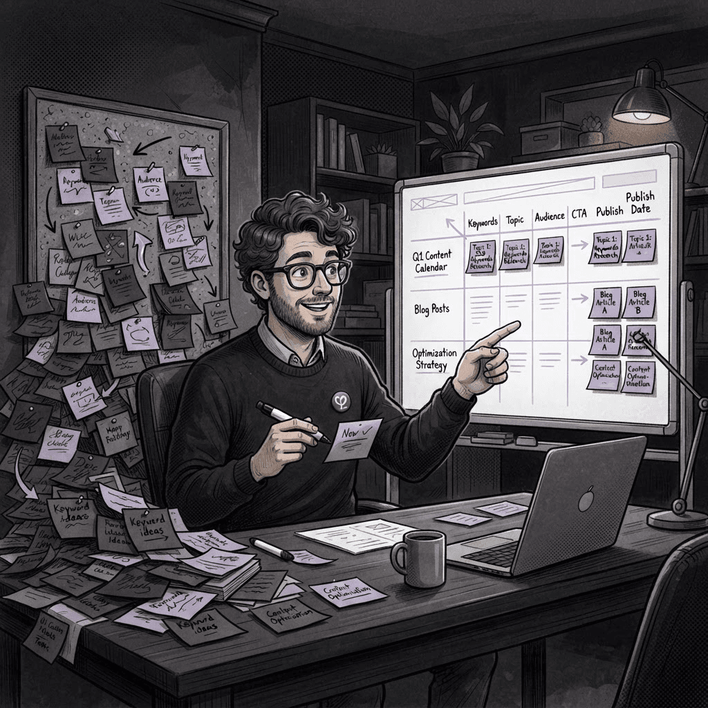
Design isn't just about looking good; it's about working well. Balancing beauty and usability is essential—make choices driven by user needs, not just your aesthetic preferences.
Practical Steps for Web Designers
- Involve users from day one. Get their feedback on early designs rather than waiting until the end.
- Use wireframes instead of polished designs. It’s easier to iterate and adapt based on user input.
- Test your designs with real users before rolling out. Observing how they interact with your site can offer invaluable insights.
- Don’t be afraid to compromise on beauty for functionality. It’s okay if your site doesn’t look like an award winner as long as it works.
Frequently Asked Questions
What if my clients insist on a certain design style? Clearly explain the potential usability issues and back it up with user data. Offer alternative solutions that incorporate their style but maintain usability.
How can I gather user feedback? Use surveys after testing, conduct user interviews, or observe live user interactions with prototypes.
Is it possible to be both beautiful and functional? Absolutely! It just requires balancing design elements with clear user-centric functionality. Always prioritize user needs.
By sharing this, I hope to save you from my trials. Our designs should help people, not just look pretty on our portfolios.

Tags